Saturday, January 30, 2016

Parisian Girl


So there I was one afternoon trying to figure out if I wanted to try my luck with PanPastels again after having a bout of allergic rhinitis the last time I used them. The book Look by Suwa was proving irresistable and I just had to make the Parisian girl's skin look silky and smooth without pencil lines no matter how micro fine. Got my PanPastel shades (I have only five in my humble collection), and started dabbing with the Burnt Sienna Tint. 

In making facial contours I'm careful not to put any color on the highest protrusions. That's supposed to be the part the light touches and so that should remain white until the end if I can help it. 
For the recessed parts I carefully dab a layer of Red Iron Oxide Tint. With this slightly warmer color I'm able to create dimension. Try it yourself by applying on the farthest shadow from the highlight first then gradually moving in with lighter dabbing and more blending. 

I create the most drama with Burnt Sienna, the darkest of them all. With this hue I'm able to lift the entire face to make it appear 3D like.

My Gelatos set by Faber-Castell was the most fun to apply. Gelatos are like oil pastels with a more buttery glide on paper. I used the metallic ones on her beret and turtleneck, leaving white spaces untouched to give the effect that bright light is washing it out.

Had so much fun with this one in fact I just finished it in two days. 


All Rights Reserved. Copyright 2016.


Saturday, January 23, 2016

Oberon and Titania's Reconciliation

Just found out after coloring this that the woman in the middle isn't Titania, that's actually Hermia, a mere mortal in the Shakespearean play "Midsummer Night's Dream". Zooming out of the original work would show you the King and Queen fairies Oberon and Titania in the center, reconciled after causing some confusions from the spells cast. There's a prequel to that obviously since, taking from the title they must've had a quarrel before. Well I don't want to go into that, it's a long story, we haven't got all night. Unlike the play, which is a good one by the way, saw it back in college.  

The lineaert is from Dover's Victorian Fairy Paintings. The original artwork is by Scottish painter Joseph Noël Paton. The insides of both the front and back covers of this book show the thumbrints of the original works for photo reference. Use a magnifying lens to study them up close, kind of lilliputian. 


It was the first time for me to use Derwent Inktense pencils and boy, was I in for a treat! Unlike those of pencils the ink pigments were absorbed gloriously by the paper when water was applied. You can't spread them pretty much though, unlike watercolor pigment that are light and can be lifted and spread around with water. Once it's settled on paper the ink refuses to budge, so I learned to take extra care in shading.

I used Faber Castell classic watercolor pencils for the lighter flesh tones since none of my other pencil sets had these weak shades. I needed the wood nymphs to look pale in contrast to the mortal Hermia. Looking back, I think Hermia's skin (where I also used Inktense and Polychromos pencils) may be a tad too hepatitic. Oh well, I can still remedy that with touches of tan.
I should say one thing about using watercolor and Inktense, it's important to stretch the paper while it dries. I hate crimped paper after drying. The tugging exercise helped tremendously. The paper on this book is hardly 100 gsm but it's a good a paper as any for wet media as long as you're willing to do some tugging. 

My Prismas and Polys joined in the fun with good ol' Vaseline to breakdown their binders. They performed remarkably well on top of the dried Inktense base. If I wanted to add another Inktense layer I just wipe off the gooey excesses of the petroleum jelly and the surface is good to go. Had no trouble achieving depth while layering with multimedia just as long as I didnt have to erase anything. Removing  pigments would be the problem. I was glad I was able to avoid that. 
After two days I was able to finish this and I was quite satisfied. 


Tuesday, January 12, 2016

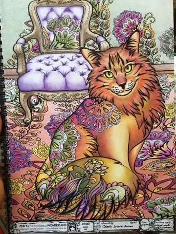
Camo Cat

Was super excited to start coloring in Narelle Craven's book "Percy and the Coloring Wonderland" after I received my copy from my Australian friend, Lia Andanar-Yu, who visited for the holidays. Narelle seemed quite happy too with my order and decided to throw in for free the first volume. 

The books are like no other! The pages are made of sturdy, glossy, and expensive cardstock paper. Narelle, being an artist herself, knows the value of working on high quality paper. My sharp pencils had a great time inserting their pigments in between the paper's thick surface which helped create the best blending I've done so far sans blenders. It's spring bound so that eliminates the struggle of having to purposely press down on a spread to color the details sewn in the seam. 

The cat's face was the most interesting feature and, I thought, if I could make it come alive then the rest of the page's story would be easier to reveal through colors. The Faber-Castell Polychromos pencils I used for the cat's head are in the photo above. 
At a certain point my busy schedule in life got in between finishing this project and when I tried to jumpstart it again a couple of times I found myself stuck. I called it "a colorist's block", similar to a "writer's block". 

A couple of posts I read prompted me to get over the hump and to stop over analyzing my color choices and just color. I was rusty and I had to erase the pink off an entire shaded area just to tell you how off I really was. Anyway, I said to myself "to hell with it, I'm just going to go with how I feel and however it turns out I'll just have to live with it". Other colorists don't normally have this angst because they color three even four pictures overnight and a mistake or two is forgiveable given their prolific coloring. 

I, on the other hand, find that I am confronted with this more than the usual because I take days now to finish an art and I find that it's not an excuse to mes up the colors since I have time to think about it. 
 
It turns out that tweaking that mental knob in my mind helped humungously. I was able to let my natural color choices flow and the story of the house morphing into the cat seemed to have come across somehow. Well, I'm not sure really, but I'd like to think it has.

I have recently uploaded this in two international sites and have been quite happy with the number of likes - not that I color for the 'likes', but hey, gotta admit it helps a bit. 

By the way I just realized in this experience that I had been added to an international coloring group without my knowledge. I didn't know this could be done. I just wish Facebook had a way to let us users control where we end up joining, that's all.

Happy coloring, coloristas!


Monday, January 4, 2016

African Turban

o
In the recent over-coffee-coloring we had a great art coach, Dino Copreros, shared with us his techniques in coloring a page. One of the tips that stayed with me was his way of starting at the bottom and making his way to the top of the page. I didn't know that when I did this page from Och Umlas' Mystery Women book, but recalling the movement it doesn seem to make sense. 

This illustration by R. Jimenez had at the bottom of the page the face of the turbaned African woman. I found the face most interesting so I attacked it first with my Prismacolor Premier colored pencils. I thought if it turns out fine then I'll do the rest, if I mess it up then that's the end of it. 

I actually was quite satisfied. But if it turned out otherwise Dino's tennet would prove right because then I could just work on beautifying the turban to draw people's attention away from the bottom.

The photo above shows my choices for the black woman's skin tone. Yes, that's green. I thought it would be interesting to mix that in for depth and drama. 


In the shadows of the face I was quite generous with the Marine Green and Light Umber, while for the parts where the light touched it I went with the brighter tones like Mineral Orange and Goldenrod. Bronze helped keep the entire look together. 

When I was happy with the face, its highlights and dark tones, the rest seemed easier to do. I thought I'd just let myself loose with the neons and brights. 

Och seemed quite happy with the end result, and am always happiest when the artist and author end up appreciating how I worked on their obras. My gosh, who wouldn't be? 🤗