Sunday, February 21, 2016

Piqued by Pastels


Since I have been receiving a number of inquiries about pastel pencils and pastel in pans I thought of dedicating this blog to that topic. I'm assuming the sudden interest is also because of the popularity of portrait and fashion coloring books like "Mystery Women" by Och Umlas, "Moon Blossoms" by Katrina Pallon, "Look" by Suwa. Perhaps like me many of you began to look for easy ways to render flesh tones on human images that would make their skin appear flawless and almost life-like.

The materials out there for this particular demand of coloring are pastels - powdered pigment bound together in different ways. They vary in form but are essentially the same in substance. The ones that can be used both as wet and dry medium are chalk pastel, soft pastel, pencil pastel, and pastel in pans.
 

For flawless skin coloring in particular my personal bias is for PanPastel. Two months ago I walked into National Bookstore bent on paying for three pans when, lo and behold, I was told that the price dropped just the night before and all of a sudden my budget (and a couple more hundreds) could afford me five pans instead! Whooopeee! (I believe the distributor already settled on the lower price point since up to now the new stocks I've seen remain marked with the lower price.)


The dust is gorgeous because, for one, it easily clings to paper unlike powdered Mungyo soft pastel or Mungyo chalk pastel. I only need to spend half the time moving the dust around before the color is absorbed by the paper's surface. Another reason I like PanPastel is because for skin coloring you'd want to visually achieve perfect smoothness which fine dust coloring gives. You eliminate pencil strokes from your work. If you take extra time to choose your application tools like eye shadow brushes, foam tips, spotter painting brushes (got mine from Craft Carrot) this powdered pastel is very easy and fun to apply and gives maximum satisfaction (for me at least). Also I find that I can also afford to make mistakes since the dust is erasable. Very good erasers I've used for this are kneaded rubber ones and the fancier but  effective Derwent electric eraser.

The biggest limiting factor in choosing PanPastel is the hefty price. With one pan you can already buy a set of other coloring materials with varying colors. But there's a way around that. I found myself suggesting to colorist friends to split among them a pan and put them in those tiny containers one finds in BEABI stores. Since the PanPastel dust is a very efficient medium you really only need a small amount each time to spread around and blend. Believe me a little will go a long way.

For me another good pastel product to use, again for skin coloring in particular, is pastel pencils. The one I'm using is Stabilo's CarbOthello. The set of 60's has a good range of browns that you can use to tone. But don't overdo the browns so you don't end up with a darker complexion that what you want to achieve. Again, these are pencils so if you want to eliminate lines you'd have to go ultra light with your strokes. Good thing going for you is that the dust is a joy to spread. Limit your blending to the edges though otherwise you'll find yourself reapplying endlessly because you keep rubbing dust off ever time your tools touch the medium.

Someone asked me how Derwent Pastel Pencils compare with Stabilo's CarbOthello. My colorist friend, Anwy, made me try them side by side and immediately I could tell that CarbOthello's colors are more striking, and smoother to apply. It appears that the pigments of CarbOthello are more fine.

What's the advantage of that? Like many colorists today the choice of medium is essential in enjoying our craft. Stress-free coloring nga e. So generally I understand why many shy away from the less vibrant, or grainy brands that makes it harder for us to achieve satisfaction.


I have to mention too that CarbOthello pencils have good- to high- lightfastness rating, not bad at all especially if you're particular about the selling quality of your end product.

So for those in a quandary as to which pastel products to pick in the market, the ones I've mentioned are safe choices since the results are immediate, and long lasting in terms of use and display.

Oh wait, here's the fixative I use by the way. Thanks Mark Dean Lim for suggesting this to me. When applying stay outdoors or in a well-ventilated area. I have yet to try in a coloring book so I can't say anything about that, but if you will protect the rest of the book by putting a big board or paper beneath the page you're spraying on. And finally, since it has binding agents it's best you don't touch your work while the material is still wet. Wait for about an hour for everything to adhere together and for the solvent to dry.


***First colored image from Mysterious Library by Bakeunji

***Second colored image from Mystery Women by Och Umlas


Friday, February 19, 2016

The Waif in the Mysterious Library

Today I had a 'eureka moment with my ink pencils and markers. I used this newly discovered (by me, atleast) technique on the hair of this image, notice that it has hints of the vibrancy of ink but blended relatively lightly. I'll be sharing how to apply that in my classes in the future so watch out for that. 

As for this waif from The Mysterious Library by Parkeunji (finding that name is another eureka moment I'll talk about later) I think I'm going to be finishing this tonight, which is a couple more hours from now. Am now working on the background which I think is not too hard, a matter of flicking and blending blues, but may take quite awhile. 
 For her skin I used PanPastel (burnt sienna and iron oxide) and touched up the tiny details with paint brushes instead of foam tips. The spotter 20/0 brush really came in handy for lightly spreading the dust of the pastel. And you know what else came in handy? My glass table top! A few dust fell off from the pastel cakes and I found myself mixing on it. Eventually I would dab the brush on the glass surface before applying the tip on the page, that way I'm careful not to put too much and avoid ending up with a gross mistake. (Incidentally this glass top also came in handy when I traced an image to transfer to another paper)

Finally here's what I learned about ordering Korean books - I can't understand them! But then a friend told me about phone apps that you can download, take a photo with, and will do translation for you. How about that! 


Here's the copyright page I translated. It still doesn't directly say that Bakeunji is the artist but I have a good feeling it is. Hyeonamsa is the publisher, it appears, see for yourself. 

Anyhow, can't wait to use this app in translating pages from Daria Song's latest coloing book The Present. The back page has instructions on certain techniques in coloring which I'd love to learn. Wouldn't you? 


Sunday, February 14, 2016

Wildergorn


Two weeks ago I received this rolled up package from the UK and got super pumped up to color again (when did I not ever?!? haha!). This time it's over an entire 40" x 27" colour-in Wildergorn poster by Jamie Courtier, former Creative Director of Jim Henson's Creature Shop. It's one of six huge line art posters seen in www.wildergorn.com. 


This one I ordered is the first one, Potter's Road.
 
I came upon Wildergorn while researching online about Tolkien's coloring books which are fantasy illustrations of the spectacular film series based on the Lord of the Rings books. Wildergorn may look Tolkienesque but it has absolutely nothing to do with LOTR. The posters are appealing because of their storylike character and it's humongous size, nothing like I've ever colored before. 

Here's the entire text from the site's Home page: 

"There's more to a Wildergorn Colour In Poster than meets the eye. By gently contemplating and hand colouring each intricate detail, you’ll find yourself being gradually drawn into the hypnotic and fascinating world of Wildergorn; the more discerning and careful you are with your colours, the more extraordinary will be the result. They’ve been coloured by actors waiting in the green-rooms of West-End theatres, by aid-workers in war zones (during quieter moments), by patients convalescing in hospital and they have united friends and families around the kitchen tables of the world.  These giant 40” x 27” Wildergorn Colour-in Posters are designed by Jamie Courtier (former Creative Director of Jim Henson's Creature Shop) to stretch your imagination and colouring skills to the limit!"


After placing my order (PhP 2,070 including shipping fee) the site sent us an email message letting me know that shipping may take quite awhile, and at the same time expressed genuine surprise and excitement since apparently this is the first time someone from the Philippines ordered from them. 

I realize now that this is a huge undertaking, literally, so I'm thinking of making this into a collab project. I might be asking around for three other colorists who would be interested to finish this with me. We'd be deciding on the medium, color scheme and other pertinent aspects of the project before starting it and hopefully end up with a cohesive work that can be displayed in a future exhibit (hey, I'm allowed to dream, aren't I 😄). The poster will be staying with one colorist for a period until he or she is done and is able to pass it on to the next, and so on. 

I'm still letting the idea ferment in my mind until I'm 100% sure it can work. What do you think? 


All Rights Reserved. Copyright 2016. 


Saturday, January 30, 2016

Parisian Girl


So there I was one afternoon trying to figure out if I wanted to try my luck with PanPastels again after having a bout of allergic rhinitis the last time I used them. The book Look by Suwa was proving irresistable and I just had to make the Parisian girl's skin look silky and smooth without pencil lines no matter how micro fine. Got my PanPastel shades (I have only five in my humble collection), and started dabbing with the Burnt Sienna Tint. 

In making facial contours I'm careful not to put any color on the highest protrusions. That's supposed to be the part the light touches and so that should remain white until the end if I can help it. 
For the recessed parts I carefully dab a layer of Red Iron Oxide Tint. With this slightly warmer color I'm able to create dimension. Try it yourself by applying on the farthest shadow from the highlight first then gradually moving in with lighter dabbing and more blending. 

I create the most drama with Burnt Sienna, the darkest of them all. With this hue I'm able to lift the entire face to make it appear 3D like.

My Gelatos set by Faber-Castell was the most fun to apply. Gelatos are like oil pastels with a more buttery glide on paper. I used the metallic ones on her beret and turtleneck, leaving white spaces untouched to give the effect that bright light is washing it out.

Had so much fun with this one in fact I just finished it in two days. 


All Rights Reserved. Copyright 2016.


Saturday, January 23, 2016

Oberon and Titania's Reconciliation

Just found out after coloring this that the woman in the middle isn't Titania, that's actually Hermia, a mere mortal in the Shakespearean play "Midsummer Night's Dream". Zooming out of the original work would show you the King and Queen fairies Oberon and Titania in the center, reconciled after causing some confusions from the spells cast. There's a prequel to that obviously since, taking from the title they must've had a quarrel before. Well I don't want to go into that, it's a long story, we haven't got all night. Unlike the play, which is a good one by the way, saw it back in college.  

The lineaert is from Dover's Victorian Fairy Paintings. The original artwork is by Scottish painter Joseph Noël Paton. The insides of both the front and back covers of this book show the thumbrints of the original works for photo reference. Use a magnifying lens to study them up close, kind of lilliputian. 


It was the first time for me to use Derwent Inktense pencils and boy, was I in for a treat! Unlike those of pencils the ink pigments were absorbed gloriously by the paper when water was applied. You can't spread them pretty much though, unlike watercolor pigment that are light and can be lifted and spread around with water. Once it's settled on paper the ink refuses to budge, so I learned to take extra care in shading.

I used Faber Castell classic watercolor pencils for the lighter flesh tones since none of my other pencil sets had these weak shades. I needed the wood nymphs to look pale in contrast to the mortal Hermia. Looking back, I think Hermia's skin (where I also used Inktense and Polychromos pencils) may be a tad too hepatitic. Oh well, I can still remedy that with touches of tan.
I should say one thing about using watercolor and Inktense, it's important to stretch the paper while it dries. I hate crimped paper after drying. The tugging exercise helped tremendously. The paper on this book is hardly 100 gsm but it's a good a paper as any for wet media as long as you're willing to do some tugging. 

My Prismas and Polys joined in the fun with good ol' Vaseline to breakdown their binders. They performed remarkably well on top of the dried Inktense base. If I wanted to add another Inktense layer I just wipe off the gooey excesses of the petroleum jelly and the surface is good to go. Had no trouble achieving depth while layering with multimedia just as long as I didnt have to erase anything. Removing  pigments would be the problem. I was glad I was able to avoid that. 
After two days I was able to finish this and I was quite satisfied. 


Tuesday, January 12, 2016

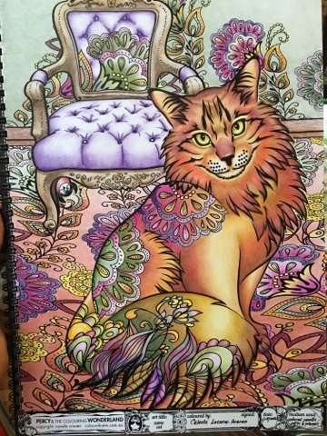
Camo Cat

Was super excited to start coloring in Narelle Craven's book "Percy and the Coloring Wonderland" after I received my copy from my Australian friend, Lia Andanar-Yu, who visited for the holidays. Narelle seemed quite happy too with my order and decided to throw in for free the first volume. 

The books are like no other! The pages are made of sturdy, glossy, and expensive cardstock paper. Narelle, being an artist herself, knows the value of working on high quality paper. My sharp pencils had a great time inserting their pigments in between the paper's thick surface which helped create the best blending I've done so far sans blenders. It's spring bound so that eliminates the struggle of having to purposely press down on a spread to color the details sewn in the seam. 

The cat's face was the most interesting feature and, I thought, if I could make it come alive then the rest of the page's story would be easier to reveal through colors. The Faber-Castell Polychromos pencils I used for the cat's head are in the photo above. 
At a certain point my busy schedule in life got in between finishing this project and when I tried to jumpstart it again a couple of times I found myself stuck. I called it "a colorist's block", similar to a "writer's block". 

A couple of posts I read prompted me to get over the hump and to stop over analyzing my color choices and just color. I was rusty and I had to erase the pink off an entire shaded area just to tell you how off I really was. Anyway, I said to myself "to hell with it, I'm just going to go with how I feel and however it turns out I'll just have to live with it". Other colorists don't normally have this angst because they color three even four pictures overnight and a mistake or two is forgiveable given their prolific coloring. 

I, on the other hand, find that I am confronted with this more than the usual because I take days now to finish an art and I find that it's not an excuse to mes up the colors since I have time to think about it. 
 
It turns out that tweaking that mental knob in my mind helped humungously. I was able to let my natural color choices flow and the story of the house morphing into the cat seemed to have come across somehow. Well, I'm not sure really, but I'd like to think it has.

I have recently uploaded this in two international sites and have been quite happy with the number of likes - not that I color for the 'likes', but hey, gotta admit it helps a bit. 

By the way I just realized in this experience that I had been added to an international coloring group without my knowledge. I didn't know this could be done. I just wish Facebook had a way to let us users control where we end up joining, that's all.

Happy coloring, coloristas!


Monday, January 4, 2016

African Turban

o
In the recent over-coffee-coloring we had a great art coach, Dino Copreros, shared with us his techniques in coloring a page. One of the tips that stayed with me was his way of starting at the bottom and making his way to the top of the page. I didn't know that when I did this page from Och Umlas' Mystery Women book, but recalling the movement it doesn seem to make sense. 

This illustration by R. Jimenez had at the bottom of the page the face of the turbaned African woman. I found the face most interesting so I attacked it first with my Prismacolor Premier colored pencils. I thought if it turns out fine then I'll do the rest, if I mess it up then that's the end of it. 

I actually was quite satisfied. But if it turned out otherwise Dino's tennet would prove right because then I could just work on beautifying the turban to draw people's attention away from the bottom.

The photo above shows my choices for the black woman's skin tone. Yes, that's green. I thought it would be interesting to mix that in for depth and drama. 


In the shadows of the face I was quite generous with the Marine Green and Light Umber, while for the parts where the light touched it I went with the brighter tones like Mineral Orange and Goldenrod. Bronze helped keep the entire look together. 

When I was happy with the face, its highlights and dark tones, the rest seemed easier to do. I thought I'd just let myself loose with the neons and brights. 

Och seemed quite happy with the end result, and am always happiest when the artist and author end up appreciating how I worked on their obras. My gosh, who wouldn't be? 🤗